Kensington Market
Re-branding Project
Project Overview
The Kensington Market Logo Redesign project was a captivating endeavor aimed at revitalizing the visual identity of an iconic cultural hub in Toronto. With a rich history and diverse community, Kensington Market required a fresh and modern logo that would resonate with both locals and visitors while honoring its heritage and vibrant spirit.


Project Reflection
-
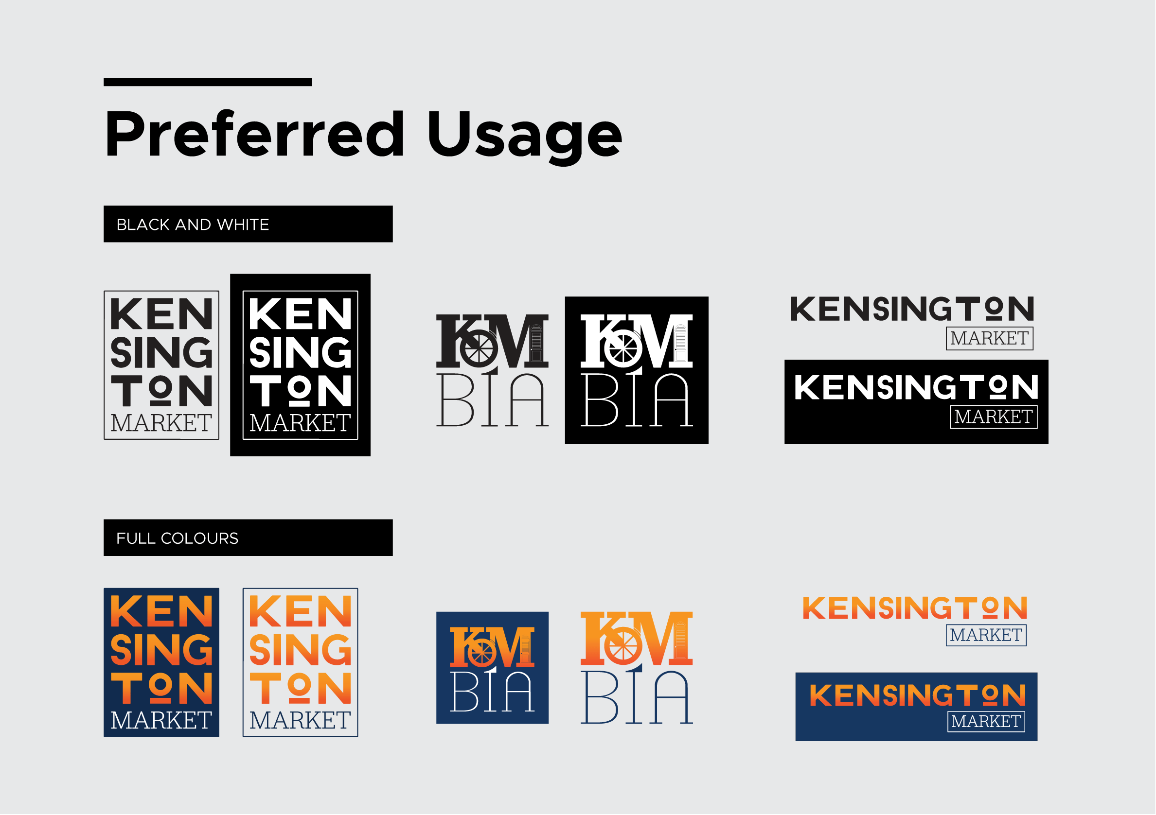
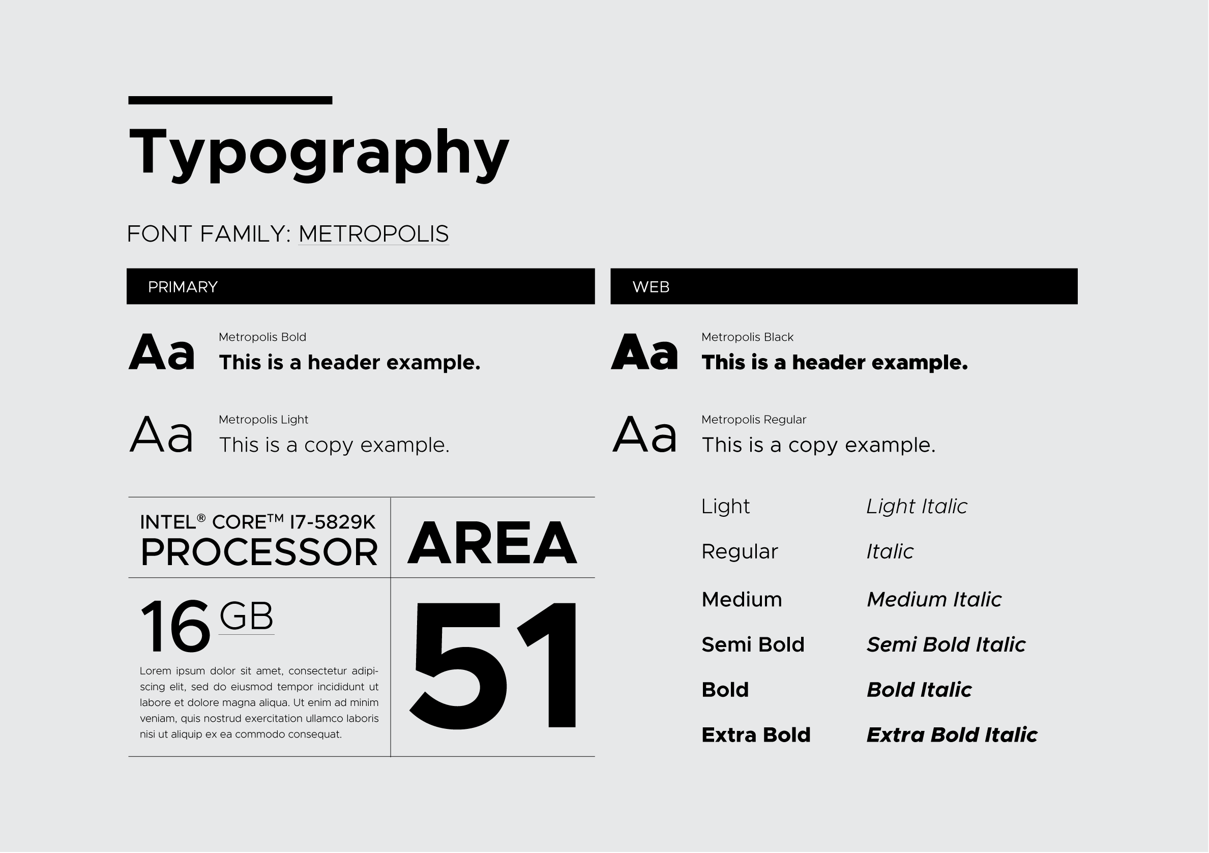
The design process began with thorough research into the market's history, culture, and values. Multiple concept ideas were generated and refined through the board’s feedback, focusing on capturing the market's eclectic atmosphere and historical significance. The chosen logo concept was meticulously executed, emphasizing typography, color palette, and iconography to convey Kensington Market's dynamic and inclusive nature. Post-implementation evaluation and feedback loops ensured the logo's effectiveness and alignment with the community's identity, resulting in a revitalized visual identity that resonates with residents, tourists, and businesses while honoring the market's heritage.
-
Through this experience, I honed my skills in conducting thorough research and analysis to understand a brand's identity and values deeply. The iterative design process, including concept development and the board’s feedback, sharpened my ability to translate abstract concepts into tangible visual representations. Collaborating with diverse board members and incorporating their input taught me the importance of effective communication and adaptability in meeting project objectives.
